
A bar chart packs the exact same open, high, low, and close data as a candlestick into a single thin vertical line with two small tick marks, no filled body, no wick shading, just the raw price skeleton. It looks sparse next to a candlestick chart, but nothing is actually missing, as this FXM680 guide explains in full.
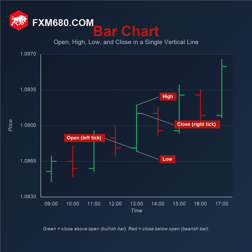
Table of Contents
- Bar Chart vs Candlestick vs Line: Same Data, Three Formats
- Anatomy of a Single OHLC Bar
- The Two Ways Platforms Color a Bar
- Reading a Sequence: How Trend Structure Emerges
- Where Bar Charts Get Used Today
- Common Mistakes to Avoid
- Frequently Asked Questions
- Continue Your Forex Learning Journey with FXM680
Bar Chart vs Candlestick vs Line: Same Data, Three Formats
The fastest way to understand a bar chart is to see it next to its two closest relatives, since all three formats are built from identical underlying data. A line chart keeps only the closing price of each period and connects those points into a single continuous line. A bar chart keeps all four values, open, high, low, close, but represents them with a plain vertical line and two small ticks. A candlestick chart keeps the same four values but fills the open-to-close range with a colored, easily-scannable body and shows the wicks above and below it.
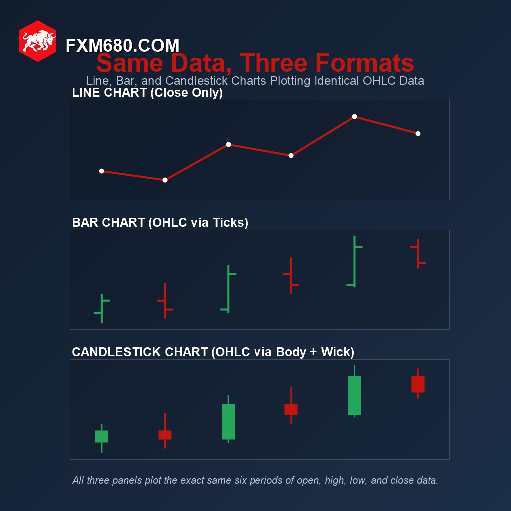
Laid out side by side against the same six periods of price data, the difference is purely visual encoding, not information. Every high, low, open, and close that appears on the candlestick panel appears identically on the bar panel directly above it; the candlestick’s colored body is just a filled-in version of the exact distance between a bar’s two ticks. Once that equivalence clicks, a bar chart stops looking like a stripped-down candlestick chart and starts looking like what it actually is: the same OHLC data, drawn with a lighter hand.
Bar charts, sometimes called OHLC charts, were the dominant charting style in Western stock and futures trading for decades before candlesticks took over. Candlestick charting itself originated in 18th-century Japan for tracking rice prices, but only became mainstream outside Japan after Steve Nison’s writing popularized it in the West around 1991. Bar charts remain the default on many professional futures and equities platforms even today, while retail forex trading has largely standardized on candlesticks.
Anatomy of a Single OHLC Bar
Every bar is built from four numbers. A single vertical line spans from the period’s low up to its high, marking the full price range the market traveled. A short horizontal tick extends to the left of that line at the opening price. A second short tick extends to the right of the line at the closing price. One line, two ticks, four data points, that’s the entire format.
The Vertical Line: High and Low
The top of the vertical line marks the highest price traded during the period; the bottom marks the lowest. The line’s length alone is a direct visual read on that period’s volatility: a long line means price traveled a wide range, a short line means it stayed tight.
The Left Tick: Opening Price
A short horizontal mark extending left from the vertical line shows where price opened. A simple memory aid: reading left to right like a timeline, the open happens first, so it sits on the left.
The Right Tick: Closing Price
A short horizontal mark extending right shows where price closed. Following the same logic, the close happens last, so it sits on the right. Comparing the left tick’s height against the right tick’s height is exactly how a bar’s color, bullish or bearish, gets determined.
| Bar Chart Element | Represents |
|---|---|
| Vertical Line | Full high-to-low price range for the period |
| Left Tick | Opening price |
| Right Tick | Closing price |
| Color | Bullish or bearish read, convention varies by platform |
The Two Ways Platforms Color a Bar
Most charting platforms let a bar’s color be determined two different ways, and few traders realize the two methods can occasionally disagree on the very same bar. The default method compares that bar’s own open to its own close. A less common but widely available alternative compares that bar’s close to the previous bar’s close instead.
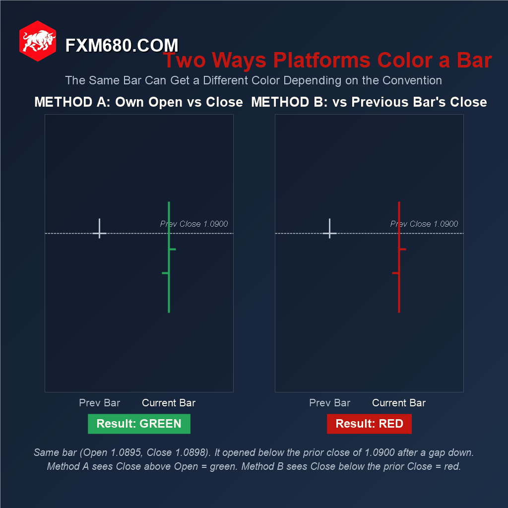
The scenario above shows exactly where the two methods split: a bar opens at 1.0895, after gapping down from the prior period’s close of 1.0900, then closes slightly higher at 1.0898. Method A sees a close above that bar’s own open and colors it green. Method B sees a close still below the prior period’s close and colors it red. Neither method is wrong, they are simply answering different questions, “did this period gain ground on itself” versus “did this period gain ground on the market’s last reference point.” It is worth checking which convention a specific platform uses by default before reading too much into a single bar’s color. Many platforms also offer an “HLC” display mode that hides the open tick entirely, useful for traders who only care about high, low, and close.
Reading a Sequence: How Trend Structure Emerges
A single bar, in isolation, tells a trader almost nothing about trend. Trend structure is a property of several bars considered together, specifically the pattern of highs and lows as price moves from one period to the next.
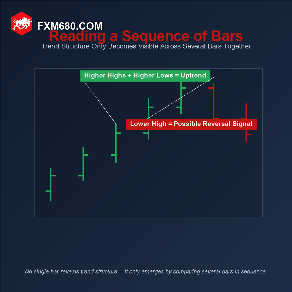
A sequence of progressively higher highs paired with higher lows is the textbook definition of an uptrend, each period building on the last without giving back the prior low. When that pattern breaks, most visibly when a new bar fails to exceed the previous bar’s high, it does not automatically mean the trend has reversed, but it is exactly the kind of structural change experienced traders watch for as an early signal worth paying attention to, not a guarantee of what happens next.
This is also where bar charts and price-action trading intersect directly with patterns like inside bars (a bar whose entire high-low range sits within the previous bar’s range) and outside bars (a bar whose range fully engulfs the previous bar’s range), both read from tick and line position exactly the way they would be read from candlestick body and wick shape.
Where Bar Charts Get Used Today
Since a bar chart and a candlestick chart plot identical data, the choice between them is mostly about visual density, not analytical capability. A thin vertical line with two small ticks takes up less visual weight than a filled candle body, which matters for traders running a dense multi-chart layout with many instruments visible at once.
That thinner footprint also matters for anyone running heavy overlay indicators, Bollinger Bands, Keltner Channels, or several moving averages plotted directly on top of price. A filled candlestick body can visually compete with those overlay lines for attention; a bar chart’s minimal ink leaves indicator lines easier to track underneath it. This is part of why bar charts remain the default on many professional futures and equities platforms even now, while forex retail trading has leaned toward candlesticks.
Common Mistakes to Avoid
The most common early mistake is simply mixing up which side is open and which is close, an understandable error since, unlike a candlestick’s color-filled body, nothing about a bar’s shape makes this obvious without first learning the left-open, right-close convention.
A second mistake is assuming a bar chart contains less information than a candlestick chart because it looks sparser. It does not, as the comparison earlier in this guide shows directly, both are built from identical data, only the visual encoding differs.
A third, subtler mistake is momentum misreading. A candlestick’s filled body gives an immediate visual sense of how far price moved between open and close, that fill area is easy to eyeball. A bar chart requires actively comparing tick heights instead, which takes an extra beat of attention and is easy to rush past when scanning quickly across many bars.
Frequently Asked Questions
Does a bar chart show less data than a candlestick chart? No. Both plot identical open, high, low, and close data; a bar chart simply represents it with tick marks on a line instead of a filled, colored body.
Why do some traders still prefer bar charts over candlesticks? Their thinner visual footprint works well for dense multi-instrument layouts and for charts running several overlay indicators at once, where a filled candle body would add visual clutter.
What’s an easy way to remember which tick is which? Think left to right like a timeline: the open happens first, so it’s the left tick; the close happens last, so it’s the right tick.
Can a bar’s color logic be customized? Yes, most platforms let color be based on that bar’s own open-versus-close, or alternatively on its close compared to the previous bar’s close, and the two can occasionally disagree.
Are bar chart patterns different from candlestick patterns? Not conceptually. Patterns like inside bars and outside bars exist in both formats since they’re built from the same OHLC data, just identified by tick position on a bar chart instead of body and wick shape on a candlestick.
Continue Your Forex Learning Journey with FXM680
The bar chart proves that visual simplicity and full data density aren’t actually opposites, it’s the same OHLC picture as a candlestick, just drawn with a lighter hand. The next lesson in this Academy explores timeframes, another foundational charting concept that applies across every chart type covered so far.
Disclaimer: The content provided on this page is for informational and educational purposes only. Trading financial markets involves significant risk. Consult with a certified financial advisor before making any investment decisions.
Keep Learning
Master Every Chart Format
Bar charts offer full detail in a minimal footprint. Explore the full FXM680 Forex Academy to keep building your charting knowledge.