
A line chart plots only the closing price of each period and connects those points into a single continuous line, stripping away every other detail a candlestick or bar would show. That simplicity is exactly what makes it useful, and exactly what makes it easy to misuse, as this FXM680 guide explains in full.
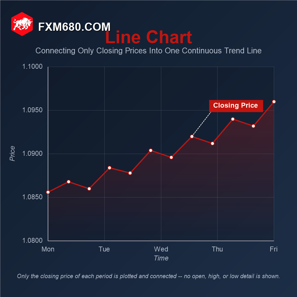
Table of Contents
Line Chart: An In-Depth Overview
A line chart is built from a single data series: the closing price of each period on the selected timeframe. Every open, every high, every low, and every intra-period swing is discarded, leaving only the one price that mattered at the moment each candle or bar actually closed. Those closing prices are then plotted as points along a time-based X-axis and a price-based Y-axis, and connected in sequence by straight line segments, forming one unbroken path across the chart.
Closing price is not an arbitrary choice. It is the price most other tools on a trading platform already reference by default, moving averages, RSI, MACD, and most other indicators are calculated from a series of closes unless deliberately configured otherwise. In that sense, a line chart is close to a literal visualization of the raw input those indicators are built on, which is part of why it remains genuinely useful rather than merely a beginner’s simplification.
Line charts also predate digital candlestick charting by a long stretch. Before charting software made OHLC (open-high-low-close) data easy to render, plotting a single closing price by hand was the only practical way to track a market over time, a legacy that shaped how heavily today’s financial media, economic reports, and long-term index charts still lean on the line format.
Why The Line Chart Still Matters
Candlestick charts dominate active trading for good reason, they show far more per period. But that same density is a liability when the goal is simply to see where price has been heading. A line chart removes the visual noise of individual wicks and bodies, leaving trend direction, uptrend, downtrend, or sideways drift, immediately legible without any interpretation step.
This is why many traders still open an instrument on a line chart first, get an instant read on the bigger picture, and only then switch to candlesticks to study the detail behind a specific move. The line chart functions less as a competing tool and more as a fast orientation layer that sits ahead of deeper analysis.
Detailed Analysis of Line Chart Use Cases
Quick Trend Assessment
Because only one point per period is plotted, drawing a trendline across a line chart is cleaner than drawing one across candlestick wicks, there is no ambiguity about whether a trendline should touch a wick tip or a candle body. For a fast read on structure, higher highs and higher lows versus lower highs and lower lows, a line chart often communicates the shape of a trend faster than a candlestick chart does.
Comparing Multiple Instruments
Line charts are the standard tool for overlaying two or more instruments on the same view, comparing EUR/USD against GBP/USD, for instance, or a currency against a commodity it tends to track. Candlestick or bar overlays become unreadable past two series; a small handful of clean lines stays legible. As a rule of thumb, keep any single overlay to around four or five lines at most, beyond that the chart stops communicating and starts obscuring.
One detail worth knowing: instruments with very different price scales, say a JPY pair trading in the 100s against a EUR pair trading near 1.0, will not overlay meaningfully on raw price. Most charting platforms solve this by letting each line be displayed as percentage change from a common starting point rather than raw price, which is what actually makes a multi-instrument comparison useful rather than one flat line and one that towers over it.
Long-Term, Higher-Timeframe Analysis
On weekly or monthly timeframes, a line chart compresses years of price history into a single clean sweep, useful for spotting where a pair sits relative to its multi-year range, or for macro-level research where individual weekly candles would add clutter without adding insight at that zoomed-out scale.
Understanding What Indicators Are Actually Reading
Since most default indicator settings run off closing price, looking at a line chart alongside an indicator makes it easier to see exactly what the indicator is responding to, without the visual distraction of wicks that the indicator itself is largely ignoring.
| Use Case | Why a Line Chart Works Well Here |
|---|---|
| Quick Trend Check | One clean line makes overall direction immediately obvious |
| Multi-Instrument Comparison | Several overlaid lines stay readable where candlesticks would not |
| Long-Term Overview | Compresses extended price history into a clean, digestible sweep |
| Reading Indicator Behavior | Mirrors the closing-price input most indicators are calculated from |
Step-by-Step Guide to Using a Line Chart Effectively
- Switch to a line chart first when opening an instrument, to get an immediate, uncluttered read on overall trend direction.
- When comparing instruments, overlay no more than four or five at once, and switch the display to percentage change rather than raw price if the instruments trade at very different price scales.
- Move to a higher timeframe, weekly or monthly, for a clean long-term view of where price sits within its broader historical range.
- Draw trendlines on the line chart when a clean, unambiguous structure read matters more than precise wick-based touch points.
- Switch back to a candlestick or bar chart before making any actual entry, exit, or stop-loss decision, since none of that fine detail exists on a line chart.
Common Pitfalls to Avoid
The most consequential pitfall is treating a line chart as sufficient for trade execution. Because only the close is shown, two periods that ended at the exact same price can look identical on a line chart while one had a calm, narrow range and the other spiked violently through both a high and a low before settling back, real volatility that a line chart hides completely. Placing a stop-loss based on a line chart alone means placing it with no visibility into how far price actually traveled during any given period.
A second, forex-specific risk is weekend and holiday gaps. A line chart’s straight segment between Friday’s close and Sunday’s open visually smooths over a gap as though price moved continuously between the two, when in reality it jumped, information a candlestick chart makes far more obvious.
A third, more strategic pitfall is the opposite mistake, dismissing the line chart entirely as “too basic” and never using it, missing out on its genuine strengths for trend clarity and multi-instrument comparison that candlestick charts do not do as cleanly.
Frequently Asked Questions
Is the line chart less accurate than a candlestick chart? No. Both draw from the exact same underlying price data; the line chart simply displays less of it per period, closing price only, rather than being wrong or approximate.
When is a line chart most useful in practice? For a fast trend read, for overlaying multiple instruments, and for clean long-term or macro-level views, situations where extra per-period detail would add clutter rather than insight.
Can indicators still be applied to a line chart? Yes. Indicators are calculated the same way regardless of which chart type is displayed underneath them, since most already run off closing price to begin with.
Should a line chart or a log scale be used for long-term views? For an instrument that has moved through a very wide price range over a long history, a logarithmic price scale (equal percentage moves take up equal vertical space) can make a line chart’s long-term shape far more readable than a standard linear scale would.
Do professional traders and analysts actually use line charts? Yes, particularly for macro research, relative-value comparisons across instruments, and quick daily orientation, even desks that trade primarily off candlestick charts for execution.
Continue Your Forex Learning Journey with FXM680
The line chart’s simplicity is a genuine analytical tool in its own right, not just a stripped-down candlestick chart for beginners. Used deliberately, for trend orientation, comparison, and macro context, then paired with a candlestick or bar chart before any actual trade decision, it earns a permanent place in a trader’s toolkit. This completes the chart type coverage within the Trading Platform Academy module.
Disclaimer: The content provided on this page is for informational and educational purposes only. Trading financial markets involves significant risk. Consult with a certified financial advisor before making any investment decisions.
Keep Learning
See The Bigger Picture Instantly
Sometimes simplicity reveals what detail obscures. Explore the full FXM680 Forex Academy to continue building your complete charting toolkit.